
Scott Brown, Head of Product Design at Creature
Scott has 20 years experience leading product design efforts for Fortune 500 companies like Cadillac, Samsung, ABC Disney, and Cigna and believes that the attention economy has created some new design challenges.
Recently, during a usability study for an app designed to support episodic healthcare journeys we noticed an interesting pattern:
Despite the fact that we were laying out clear next steps that a patient could take (e.g., selecting a provider, verifying coverage, etc.) in context of their journey, some users ignored this guided feature in favor of more direct (although less contextual) navigational shortcuts. While this guided information wasn’t presented in a true feed format, it probably resembles a feed enough in that it:
• Lives on a home screen
• Is presented below the page header and navigation
• Exists within a card format
• Is mixed in with educational content that is contextual to the patient’s journey
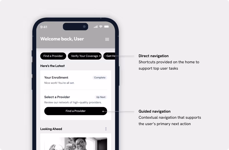
The good news is that we’ve designed for both the direct and guided paths. That said, there is good reason to pause and reflect when we’re thinking about devoting such a large amount of screen real estate to the guided path.
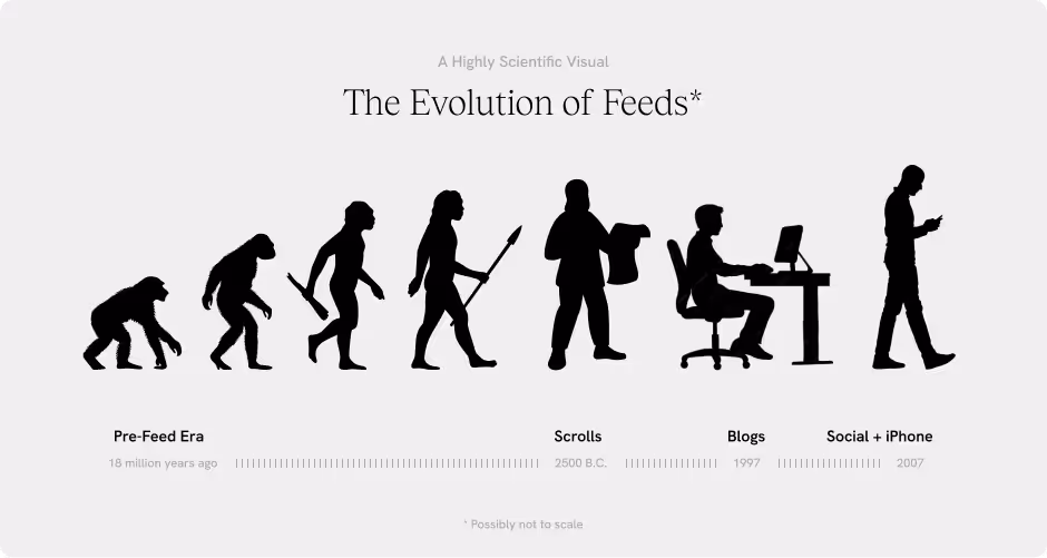
But first, how did we get here?
We’ve been using reverse-chronology feeds since we first adopted email inboxes and, for the most part, they work: they’re efficient, they highlight what’s new, and they tend to reflect how data is structured on the back end. Beyond inboxes, we saw the pattern make its way into blogs, RSS feeds, and ultimately social media—which collided with the emergence of the portrait-oriented (hello, scrolling!) iPhone in 2007.
It’s not hard to point the finger directly at social media, the attention economy, and vertically oriented mobile devices for the explosion of endlessly scrolling feeds and their negative impacts, most of which lead users to disengage or ignore valuable content because of:
1. Information Overload: The endless stream of content can overwhelm users, making it hard to find what’s actually important. Scrolling through irrelevant or repetitive content creates fatigue, leading users to disengage.
2. Infinite Scroll: While infinite scrolling keeps users engaged, it can also lead to loss of context (where was that post again?), difficulty navigating, and a feeling of never-ending consumption.
3. Lack of Content Hierarchy: When all content looks the same, important information gets buried. Users can miss updates that actually matter while being bombarded with low-value content.
4. Engagement Traps: Feeds often exploit dopamine-driven engagement loops, keeping users hooked without real satisfaction. This can lead to fatigue, frustration, or regretful time spent online.
So, where do we go from here?
We are fortunate in that we’re not trying to design a true feed. We simply need to overcome some of the behavioral tendencies that feeds have created in users to ensure folks get where they need to go. We have a few working hypotheses on how we might overcome these challenges that we’ll be exploring and testing in the coming weeks:
1. Customization: Offer user controls for content curation, so they can shape their own experienceOffer multiple views (e.g., personalized vs. chronological)Give users the ability to adjust personalization settings.
2. Visual Hierarchy: Use visual hierarchy (size, color, spacing) to give key content visual liftBetter implement content grouping labels (e.g., “The Latest,” “What to Expect” ) or explore the use of motion to highlight key content or updates.
3. Interactivity: Provide bookmarks or save-for-later featuresAllow users to pin or highlight high-priority items or explore health-related data trackers to further drive personalization.
Final thoughts…
While the options above would be focused on iterating on the existing approach we may simply consider moving away from a vertically scrolling, card-based pattern to avoid the traps associated with today’s feeds. It could be that a more dedicated approach to the home screen that focuses solely on the guided approach might be a better solution. Feeds may have their place in the attention economy (for better or worse) as they’ve become culturally powerful and are familiar to just about any user we’re designing for these days. That familiarity, however, may be exactly why they may not be the path of choice for some users in the healthcare space.